Mar 31, 2016 admin
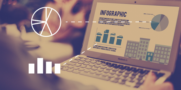
There has been a lot of debate about whether or not infographics have officially lost their punch. Five years ago, the lengthy, forever-scrolling infographic with over-the-top vector illustrations was a novelty and captivated readers. They were the picture book of the Internet and we couldn’t get enough. (If you were like me, you probably bookmarked every cutesy, information-overloaded piece you could find.)
During the infographic craze, this form of visual storytelling became a bread and butter tactic for PR professionals as we pitched stories and content to media. However, patterns and demands by readers and publishers are always changing and we must actively adjust to fit these trends. In short, the opportunity to place infographics as earned media has substantially shrunk, caused in part by infographic overkill and also by a pushback from editors, loathe to have to substantiate every single data source embedded within infographics.
Another reason we are pronouncing the (near) death of the infographic is because attention spans are shorter today than in recent years, meaning it's harder to convince readers to spend the time needed to consume a long, extensive visual piece. As a result, readers are ditching them halfway causing spikes in publishers' bounce rates.
Today, we are seeing greater media appetite for micrographics: smaller, short and sweet visuals that are sprinkled throughout the body of an article. Not only do they help guide the reader through the narrative, they also encourage you to actually read the full article - rather than using an extended graphic to replace the article.
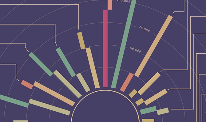
Readers - and publishers - are also seeking more sophistication from visual storytelling, especially with the big data explosion and its ability to become the visual. Data visualization has a sense of purity; it allows the data to dictate the relationships between visual elements, creating patterns which reveals an objective “truth” that is based on fact. Often I am asked, “what is the difference between an infographic and data visualization?” My answer is always, “an infographic can have data visualization, but data visualization cannot have an infographic”. Infographics often include statistics and tidbits of data surrounded by an illustrated, subjective story. By comparison, a truly data-driven visualization is objective and does not depend on a narrative.
The need for sophistication also carries over to design and style trends. Cartoon-like vector illustrations and playfulness are taking a back seat to more complex, geometric forms that add to the credibility of the content. Creativity and visual experimentation is expanding to include more mixed media including photo-viz, video, and interactive media. In addition, the use of D3, a javascript library that produces data-driven content, has taken data visualization to another level of complexity. D3 produces dynamic content by binding data to visual elements in the form of robust charts, graphs and diagrams. Furthermore, because D3 is browser-based, it allows for animation, interactivity, and complete control of the design through HTML and CSS.

Social media has also influenced how we stumble upon and absorb graphics. We know that 63 percent of Facebook and Twitter users look to these social channels for the latest news, and that visuals significantly increase the chances of ensuring visibility for your content. Naturally, we need to adapt our visual storytelling to best fit these platforms and take advantage of their reach - this is done by dividing up content into smaller, digestible pieces. For example, animated GIFs and cinemagraphs are clearly more attention-grabbing than static content (just take a look at your Instagram feed and see what you are more likely to stop and look at).
Though all roads are leading further away from the “traditional” infographic, I hesitate to say they are dead. The form of your content is always determined by its function and factors such as your audience, the target publication, tone, and the story. Let's say, for instance, you are going to create a visual for an April Fools Day campaign: a heavily illustrated, cute, cartoon-like direction might be the perfect fit. However, if you’re creating something to accompany a political science piece, then visuals that are objective, simple and sophisticated with compelling data would be the way to go.
Ultimately, the key is to recognize when one design trend is starting to wane and to be bold enough to use new tools, technologies and inspiration to create powerful new modes of visual storytelling.