Aug 16, 2017 Beth Monaghan
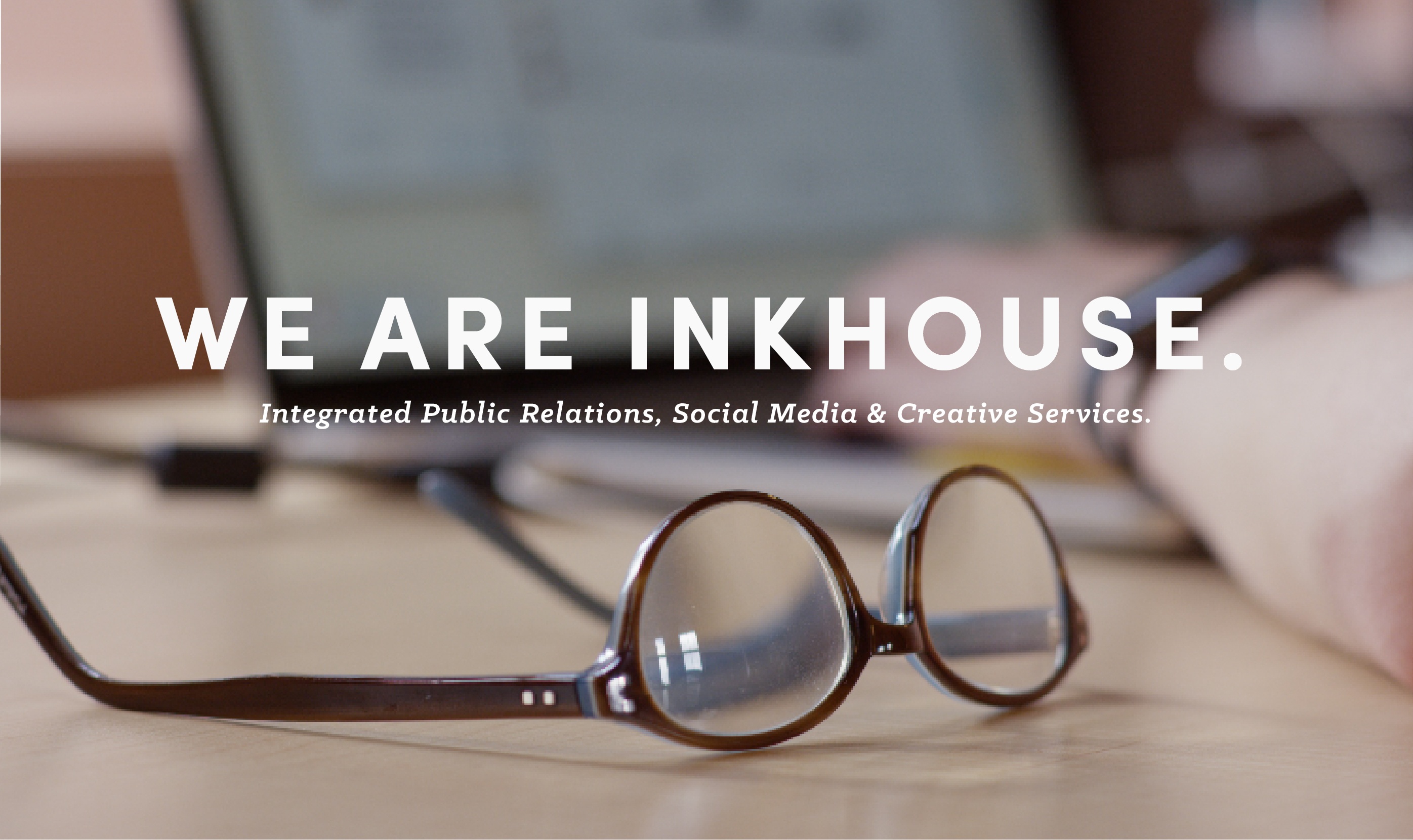
InkHouse turned 10 years old this year, which seemed like a good time to give our online presence a revamp.
We took the opportunity to overhaul our site, and content, from top to bottom. Our code is clean, our load times fast and the experience as a whole is better than ever.
In crafting this site, our goal was to put you first, making a quality user experience our priority. We took a mobile-first approach, and built intuitive navigation that guides you to the exact content you are looking for—no fluff, no filler.
- The new responsive layout:
Showcases our amazing people and culture
Leads visitors to examples of our work
We share more case studies, film and design portfolio work, illustrating how we move the needle for our clients. Our insights section curates the best of InkHouse thought leadership and our award-winning blog is easier to access (and subscribe to) than ever.
The entire InkHouse team contributed to this latest site. We certainly learned a lot in the process and we hope it shows. I hope you love it as much as we do.

Beth Monaghan
CEO & Co-Founder
.png)
