Dec 10, 2019 Michele Trio
When it comes to your brand, understanding how visual styles are changing and evolving is a crucial tool in staying relevant. Your brand’s visual identity is just as important as your messaging and content, and it is often the deciding factor in whether a potential new customer quickly bounces or stays on your website or product page. After all, we’re living in an age of inattention.
With 2020 just around the corner, we’re looking at the visual trends that are emerging - from vintage to futuristic - and how we predict they’ll influence the next year of customer engagement, marketing and storytelling.
Minimalist Landing Pages (Credit: Zendesk, Calendly, WeWork, Slack)
Keeping your landing pages simple will achieve better load times and compatibility with mobile devices, which in turn will help improve Google ranking. And it’ll increase engagement too -- with 54% of users saying they will exit the content if it takes too long to load. Brands are finding ways to leverage the minimalist layout to create a clear path for the user, often guiding them directly to a prominent call to action.
Bold Typography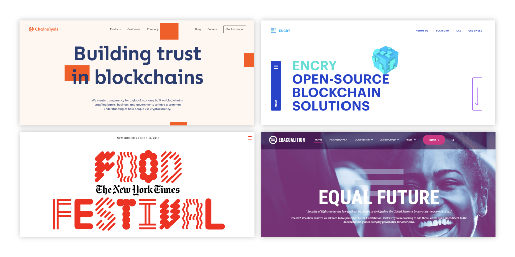 (Credit: Chainalysis, Encry, NYT Food Festival, ERA Coalition)
Oversized lettering and bold typography draws attention to your brand name or business objective while keeping the rest of the design relatively minimal. Measured use of bold text not only directs the reader to where they should look first, but it also doesn’t overwhelm them with daunting amounts of content. It’s an easy, beautiful way to make a statement -- especially on social media, where you want to get your message across succinctly as users scroll.
Muted Color Palettes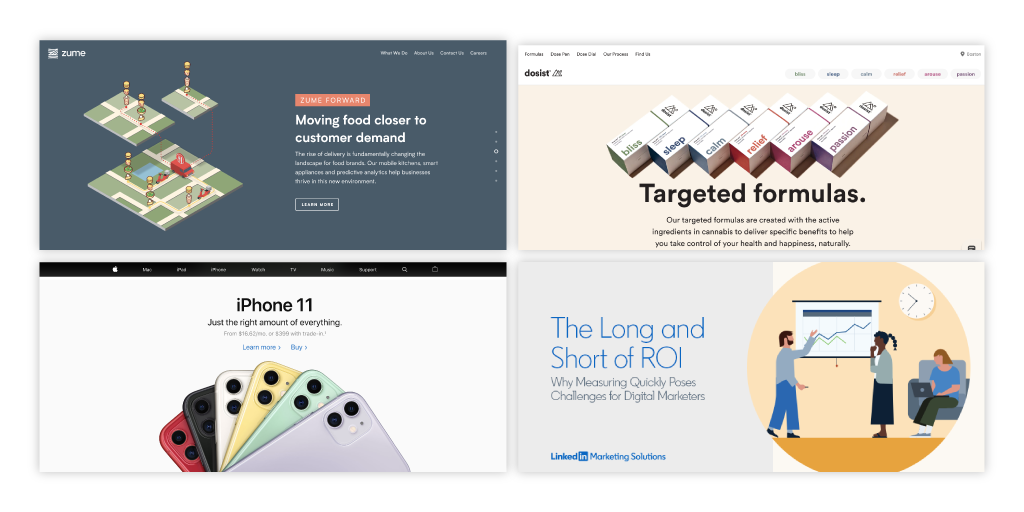 (Credit: Zume, Dosist, Apple, LinkedIn Marketing)
Stepping back from the vivid bold color trends of last year, muted colors will become more popular in 2020. Muted colors have a slightly desaturated tone, and are closer to those found in nature. With trust being such a key factor in customer decision making, it’s not a surprise that natural hues can be perceived to be more authentic, and brands are starting to incorporate more into their brand guidelines. The readability of muted colors is actually friendlier on the eye, making it more accessible to a wider audience.
This shift in thinking doesn’t necessarily mean visuals will be more monochromatic, in fact when a more muted palette is utilized correctly the range of colors you can use without being overwhelming actually widens. This allows for brands’ to keep their visuals looking diverse and fresh.
Authentic Imagery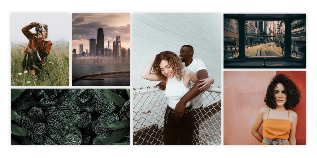 (All images via: Pexels)
In tandem to the color shift, we will see a lot more trendy, Instagram-esque photos with toned-down colors and nostalgic aesthetics. The focal subject matter will be more authentic and unfiltered, as well as captured in candid, natural states without any touch-ups or airbrushing.
Organic Geometry (Credit: Hubspot, Inrupt, Maslo, Norwest Venture Partners)
Overly modular, proper and rigid shapes that were once so popular will be replaced with flowing, organic shapes to convey natural, approachable and authentic affinity towards your brand. We foresee this shining through in illustrations as well as layout, where margins and grid systems will be retired for good. This aesthetic signifies that your brand is fun and that you don’t take yourself too seriously.
What's so great about these new trends is that they all work together and complement each other well - a muted color palette mixed with some flowing shapes on a minimal landing page is a surefire design win! With these predictions, you’ll be ready to tackle all the creative projects that come your way next year, and if you don’t have a designer on staff and need some extra help, the InkHouse creative team is happy to chat!